Currently live on fxhash at www.fxhash.xyz/generative/slug/aristotle
This experiment is live at www.funkyvector.com/#/home/design:aristotle
Famous last words, the creator.
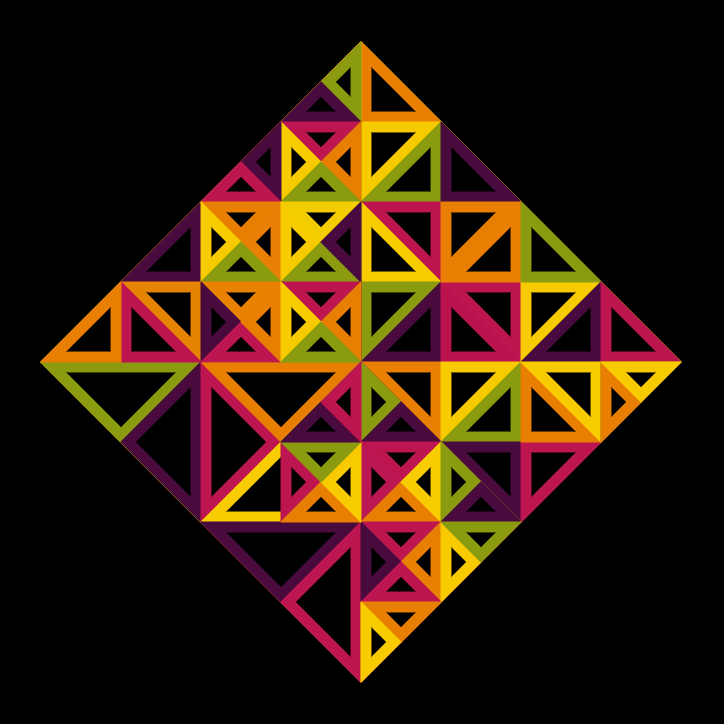
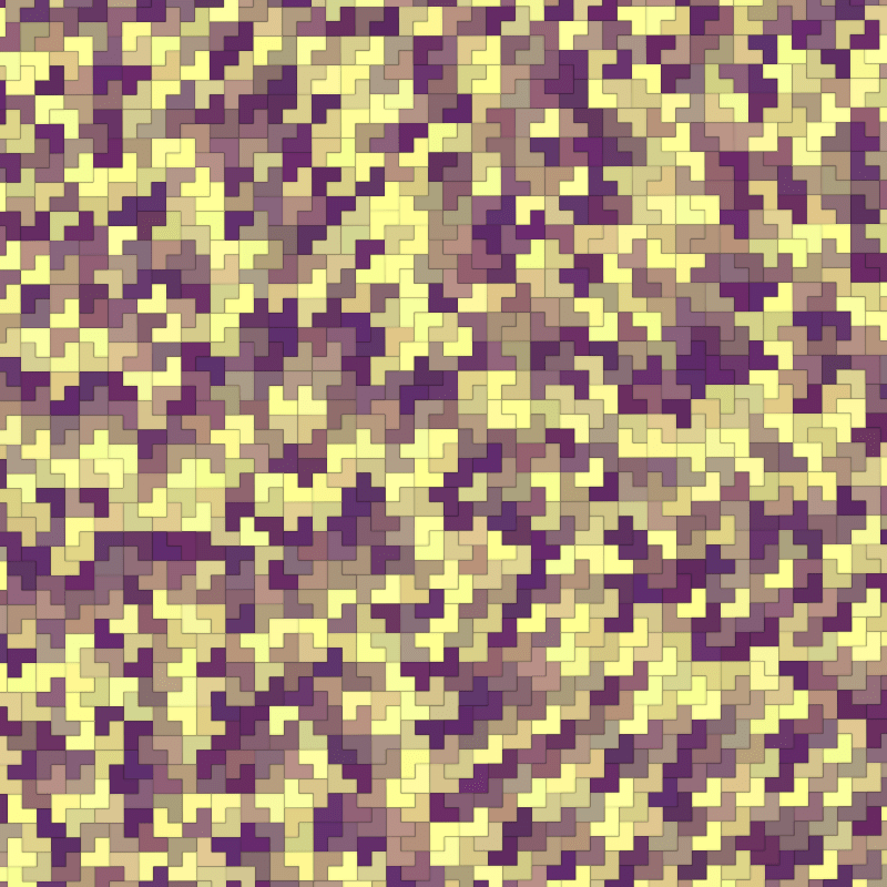
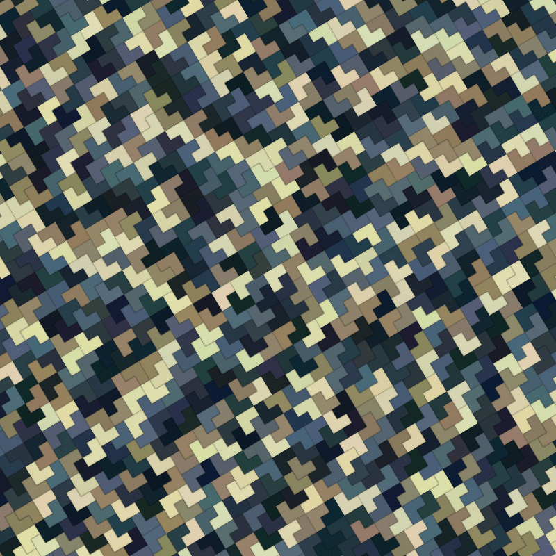
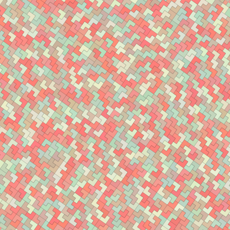
It’s time to tessellate!
The easiest tessellation is squares. The second easiest is triangles, and here we are. Animating triangles was the goal. The idea was similar to hexagon tile, but with 3 less sides and without the morphing colour idea (hexagon_tile picks neighbours and randomly chooses to adopt their colour or morph it). Instead, gradients were applied to each tile and each tile would be animated in and out of existence with a time based animation algorithm.
The other variation from usual FunkyVector graphics which are typically canvas based was to use Scalable Vector Graphics (SVG). Oh, vector, my friend! So easy to render, so easy to manipulate, so easy to animate with CSS transforms and transitions… but, no, not so friendly. It seems impossible to optimise any SVG performance when frame rates are challenged by too many operations. Even with the hardware acceleration of CSS transforms.
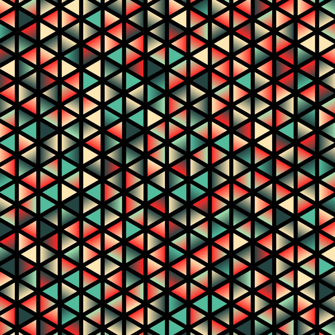


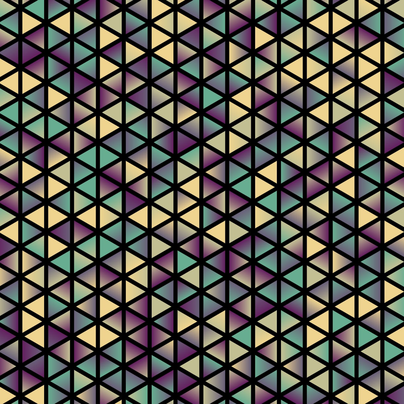
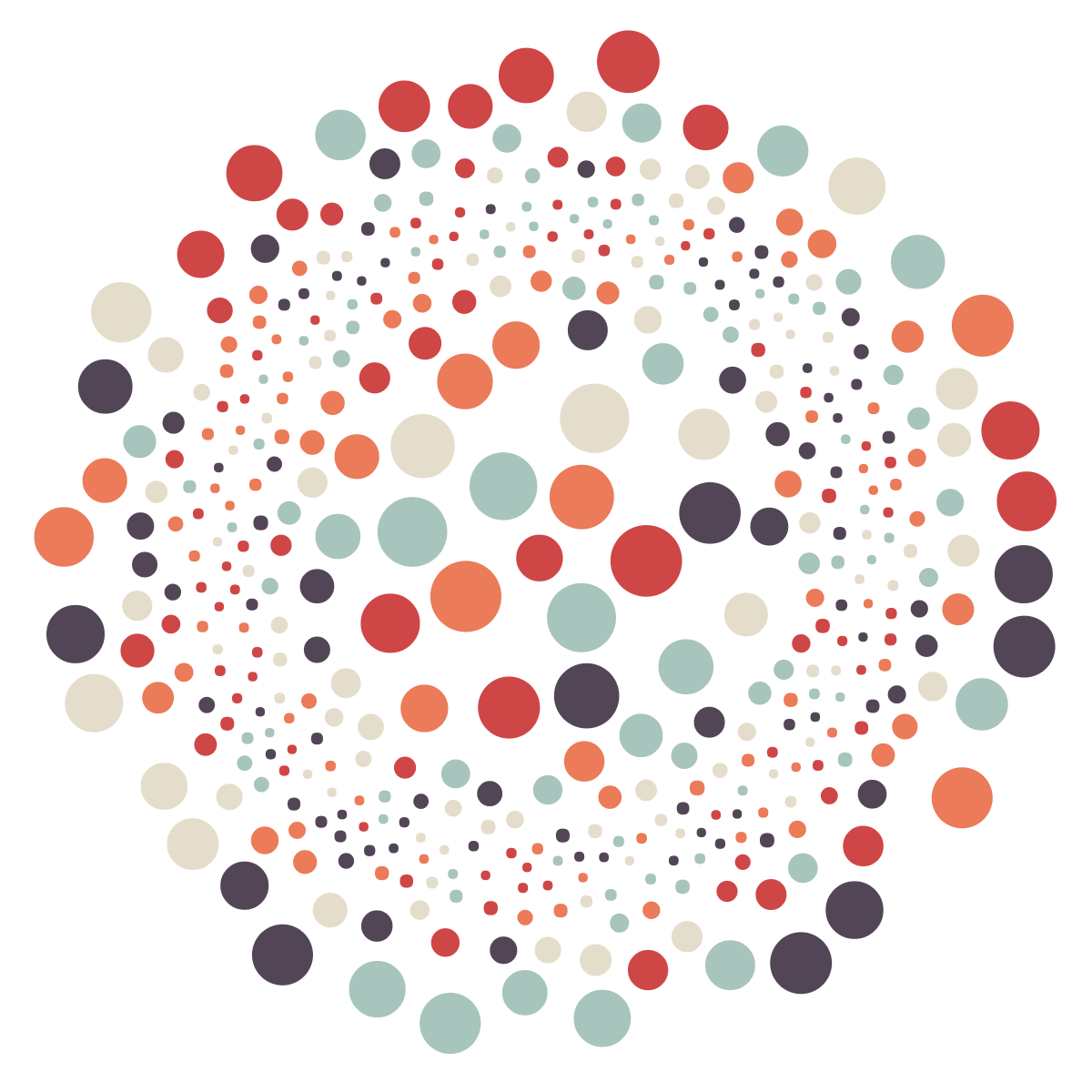
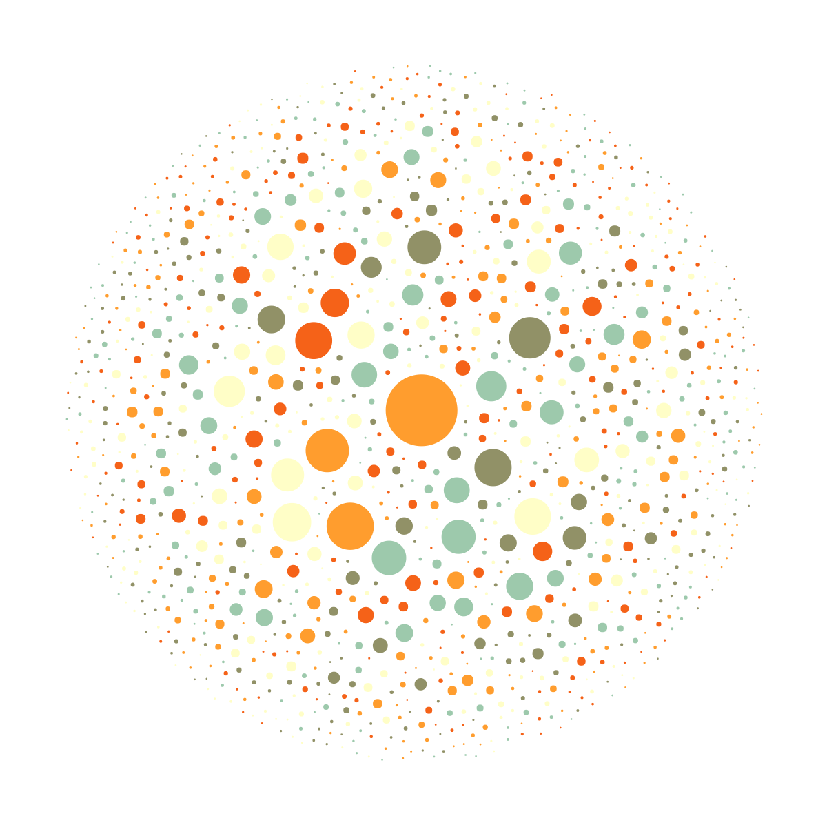
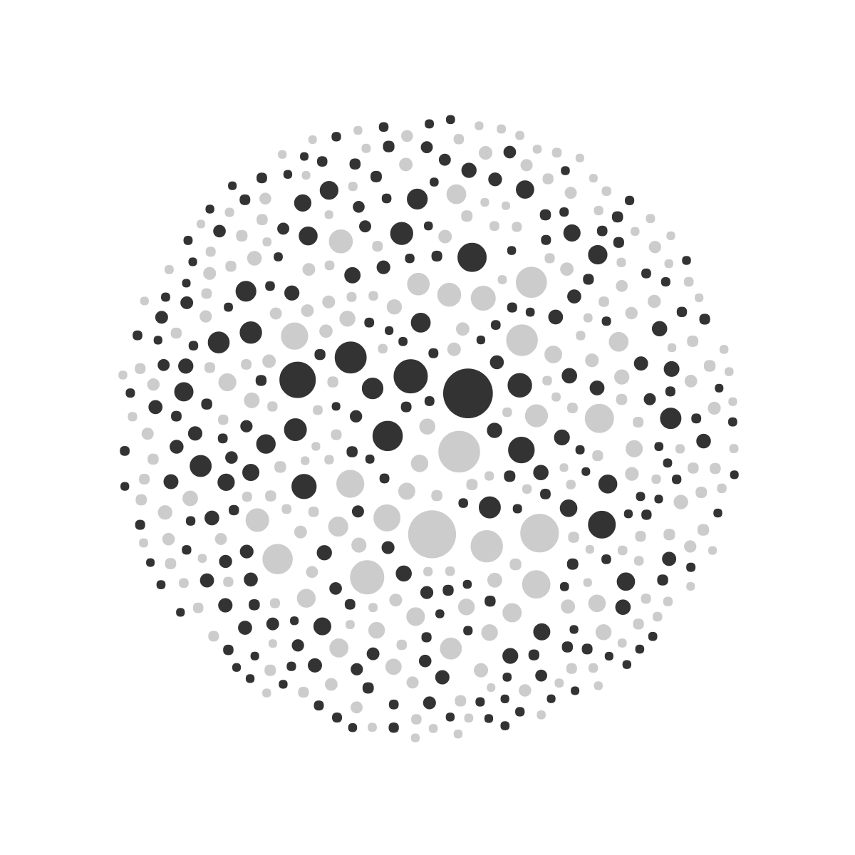
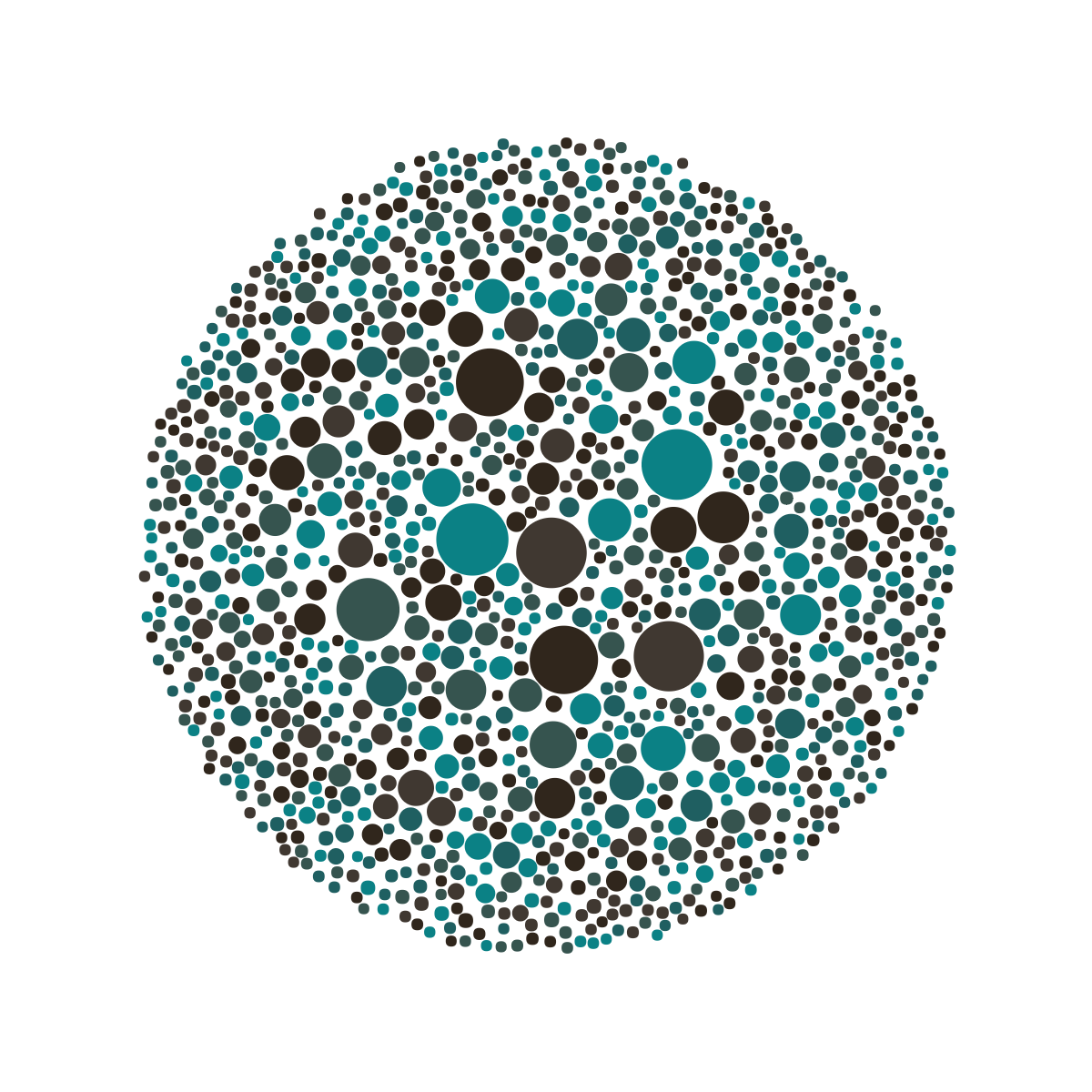
Aside from the swirly animations which are once again sin + cos with multiple oscillators, the other interesting feature is the gradient generation. Each variant of the piece has 3 sets of colour schemes, which internally have 16 gradients. These are defined inside SVG’s <defs> attribute.
    const createGradient = (gradientIndex) => {
      const numColours = 2;
      // following logic is good for gradients with 3 or more colours, seems over complicated for 2, but 2 colour gradients look better.
      // basically want to spread gradients from -100% -> 200% so they are smoother
      const start = r.getNumber(-100, 0);
      const end = r.getNumber(100, 200);
      const delta = end - start;
      const stops = Array(numColours)
        .fill()
        .map((_, colourIndex) => {
          const zeroToOne = colourIndex / (numColours - 1);
          const offset = start + zeroToOne * delta;
          return `<stop offset="${offset}%" stop-color="${c.getRandomColour()}"/>`;
        })
        .join("");
      return `<linearGradient id="Gradient${gradientIndex}" x1="0" x2="1" y1="0" y2="0">${stops}</linearGradient>`;
    };
Each triangle picks a Gradient# to use. Thanks SVG, that was easy!
The deadline: World Tessellation Day
This experiment, started in late 2021 is now ready for publishing. Definitely spawned by the Non Fungible Token (NFT) woop-doo, but the NFT craze looks like it’s fading away…
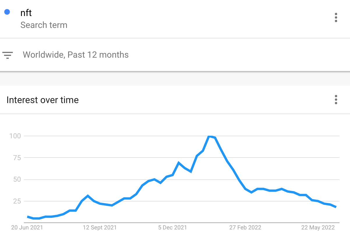
Never the less, this project had to be done. And there was a deadline in mind, not at the time of creation, but come midyear 2022, World Tessellation Day was looming on June 17th (M. C. Escher was born on this date in 1898).
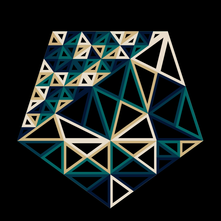
Other recent tessellation
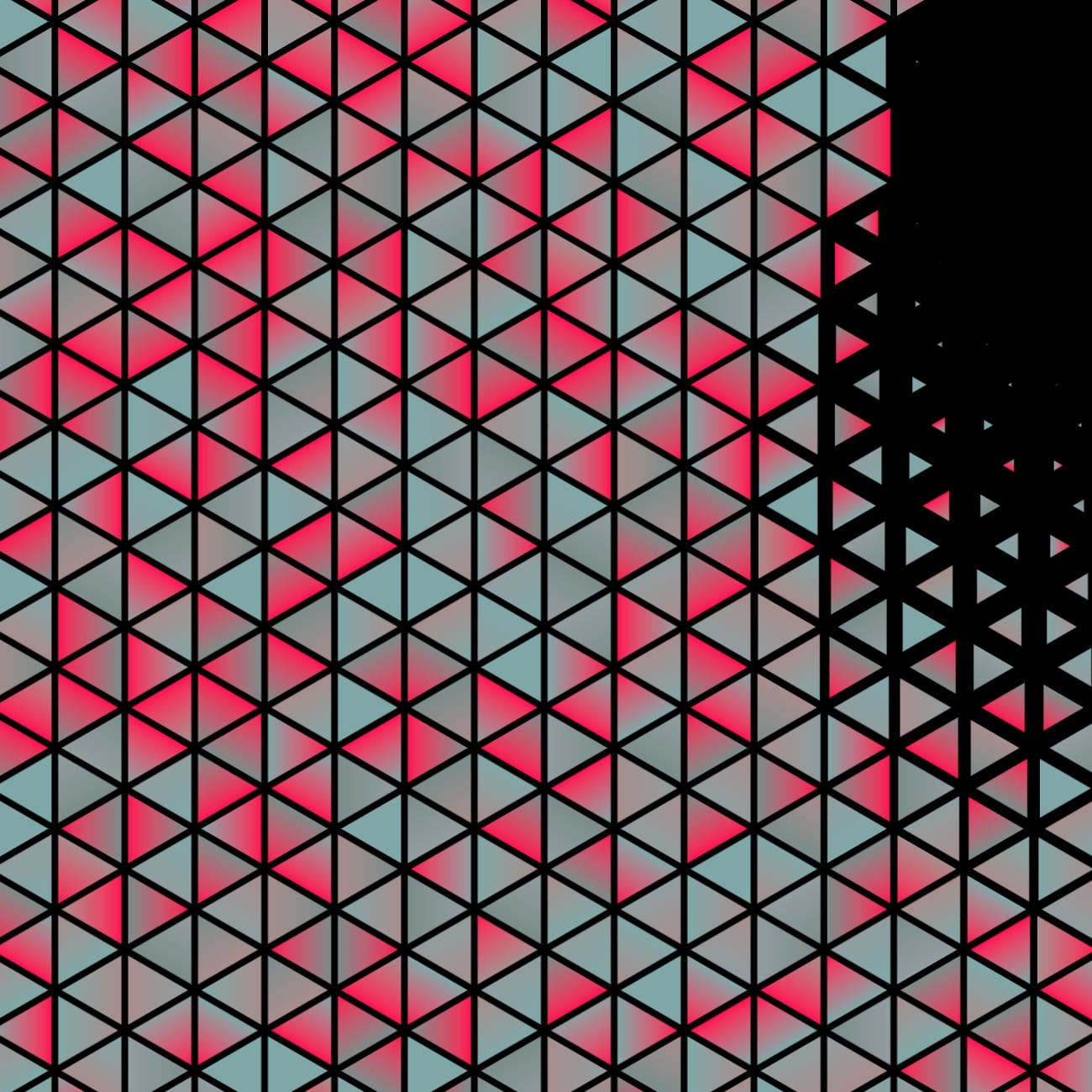
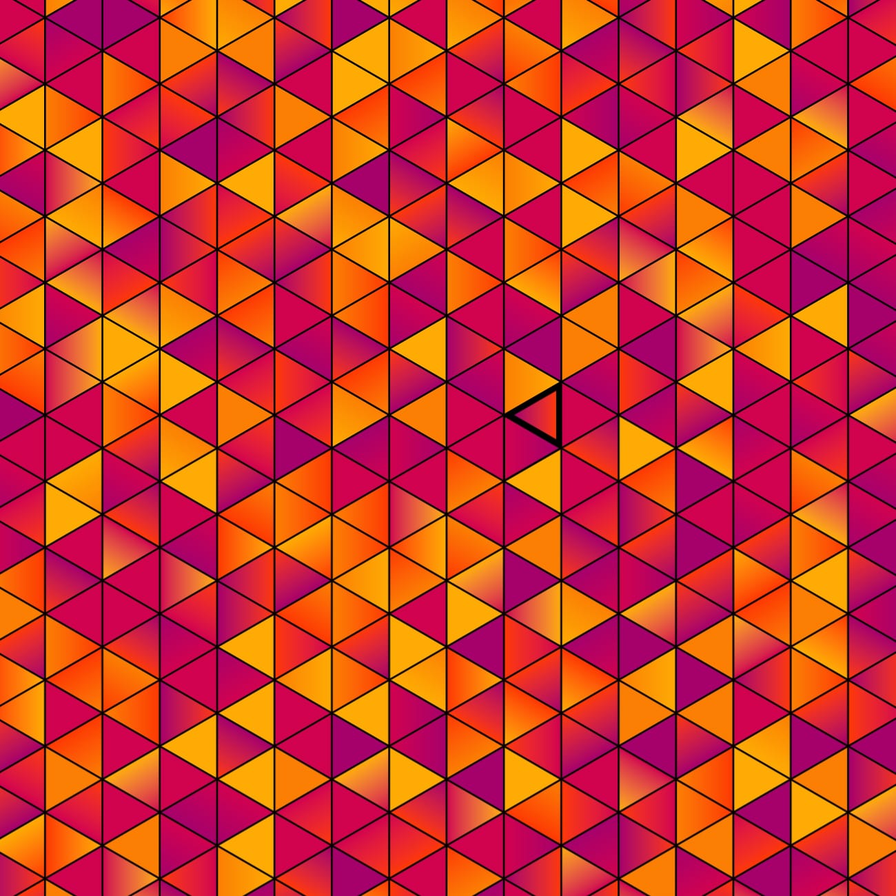
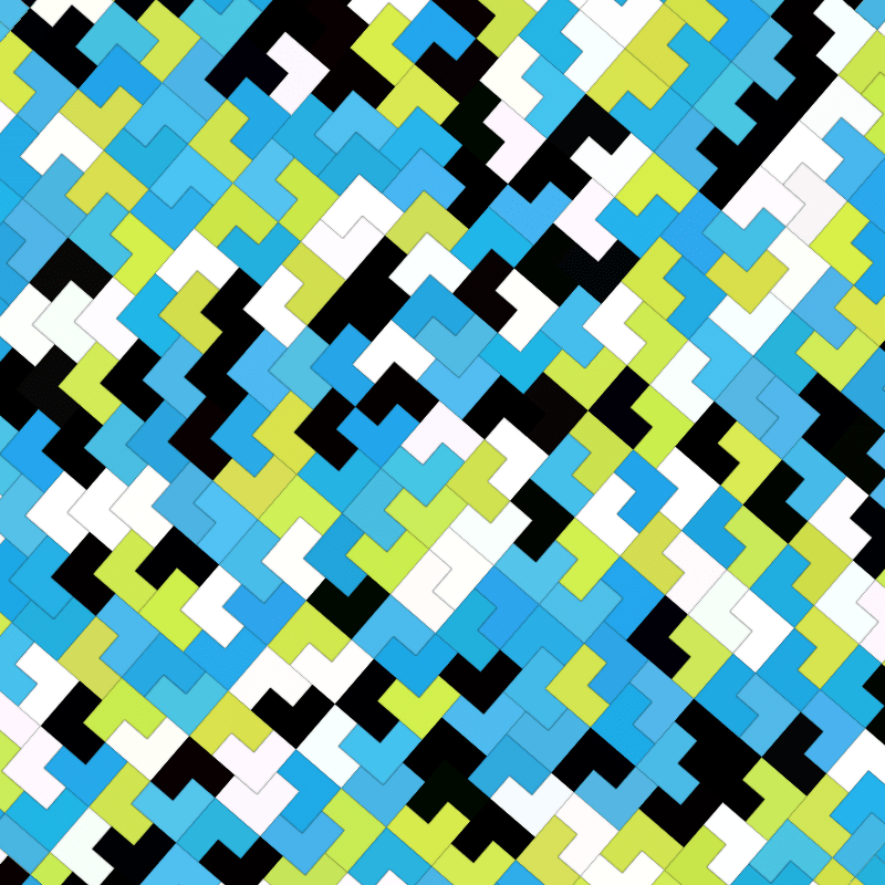
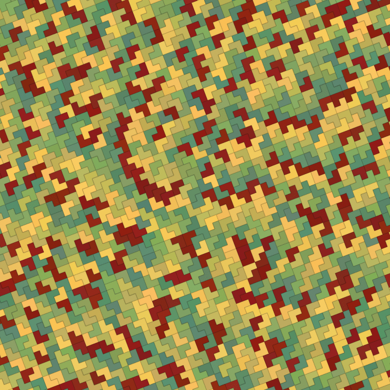
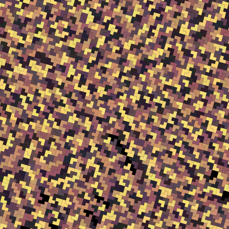
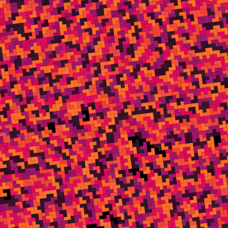
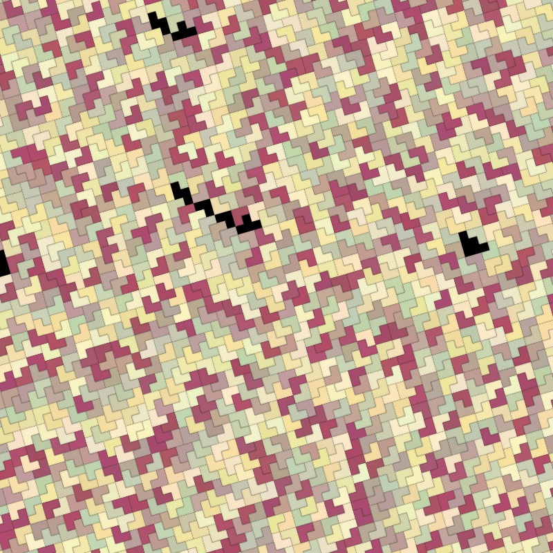
When it comes to tessellation, there are an infinite number of awesome ways to combine regular and irregular 2d objects into a pattern with no gaps. I had some fun with the L shaped Tetris piece a while ago, unfortunately there was a glitch in the algorithm, but only rarely seen. See last image.


Pseudorandom Number Generator (PRNG) Error
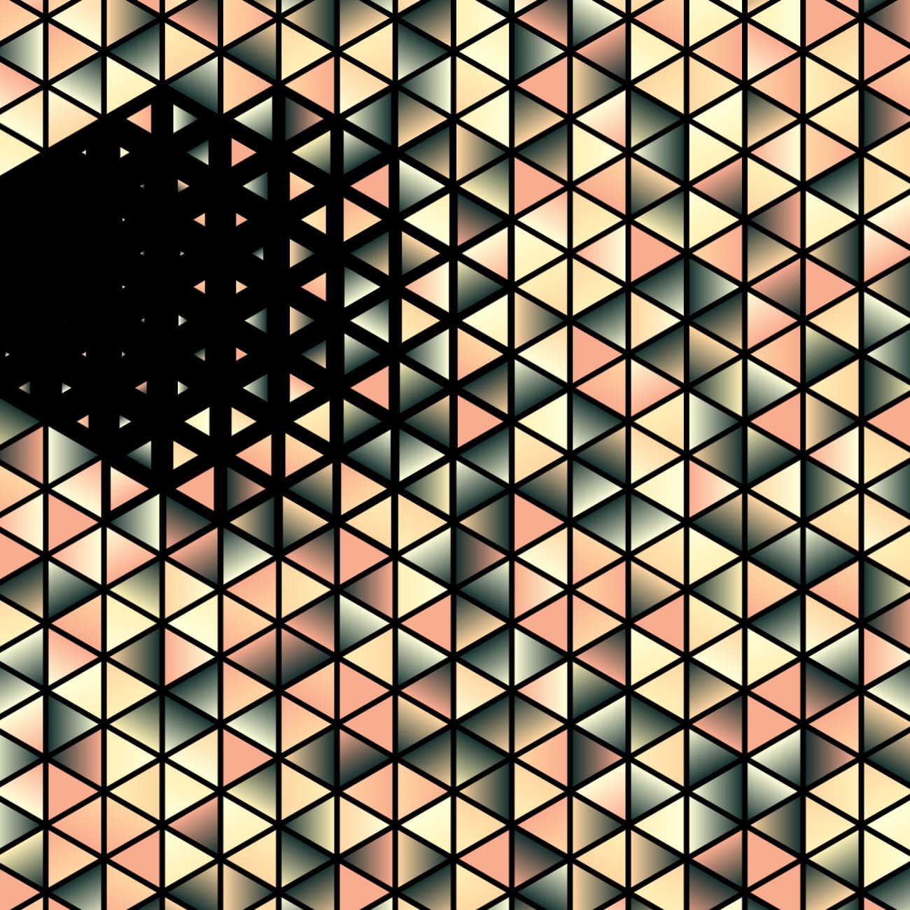
The biggest hiccup was the identifying of an error in the FunkyVector pseudo random number generator, which was copy/paste off somewhere on the internet, because bit shifting, large numbers and, well, deterministic random generators are not my forte.
Turns out feeding in a seed as a float rather than an integer caused my rand function to interpret it as a string – a dot (.) is apparently not a valid symbol in a number, duh! This resulted in identical outputs from different hashes on fxhash.xyz. You can see them if you look at Interpolated. (hint #9 & #11)
Thanks to @sho for identifying this! There might be a fix that is backwards compatible but with 1000s of generated images online and with a promise that the FunkyVector app will always generate live links forever, this is risky.
Turns out the fxhash PRNG algorithm has a mild issue too, the same first random number (a call to fxrand()) will occur within 1000 iterations using any seed hash (fxhash), but luckily it will not result in two consecutive numbers which are identical.
const outputs = [];
let i = 0;
while (i < 1e5) {
  const {fxrand} = once(); // once is a fxhash 'factory', basically the fxhash.xyz boilerplate.
  const x = fxrand();
  const y = fxrand();

  const stash = x; // this has a duplicate in <1000 iterations.
  // const stash = y; // as does the second call, ignoring x.
  // const stash = `${x}:${y}`; // but with two consecutive calls, no worries.

  if (outputs.includes(stash)) {
    const foundIndex = outputs.indexOf(stash);
    console.log("found", stash, outputs[foundIndex], foundIndex, i);
    throw new Error("duplicate");
  }
  outputs.push(stash);

  if (i % 1e4 == 0) {
    console.log("progress", i);
  }

  i++;
}
The above outputs something like the following, in this case iteration 155 and 276 have the same first value:
progress 0
found 0.9891815185546875 0.9891815185546875 155 276
testfxhash.js:49
    throw new Error("duplicate");
    ^
Error: duplicate
Instead, commenting out stash = x and enabling const stash = `${x}:${y}` results in:
progress 0
progress 10000
progress 20000
progress 30000
progress 40000
progress 50000
progress 60000
progress 70000
progress 80000
progress 90000
all good after 100000 iterations
Side note, this last test also takes a hell of a lot longer since the array lookup is searching for a long string of numbers rather than finding a number in output.